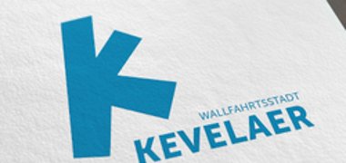
Logo of the pilgrimage town of Kevelaer

The logo is part of the visual image of the pilgrimage town of Kevelaer. It depicts the various aspects of the town and conveys a very special feeling. It leaves a lasting impression on guests and residents and increases identification with the pilgrimage town.
This is exactly what the new logo of the pilgrimage town of Kevelaer achieves with its visual DNA: if you connect the districts of Kevelaer on a map, a dynamic, special and unmistakable "K" becomes clear. It has always been there. And anyone who wants to can recognize a "K" that is on its way: whether as a pilgrim, a resident, an entrepreneur or a visitor to the town.
The colors of the new corporate design are derived from the coat of arms of the pilgrimage town of Kevelaer. The main color is therefore Kevelaer blue. The warm color tone creates a feeling of well-being and warmth (solidarity / sense of community). The contemporary and modern font Museo by Dutch type designer Jos Buivenga is the perfect design partner for the figurative mark and can set clear accents in further communication.
The logo was developed by the city administration together with the agency Benning, Gluth und Partner from Oberhausen with the participation of representatives from the church, trade, art and business sectors and approved by the Kevelaer Pilgrimage City Council at its meeting on December 19, 2019.
Along with the logo, the pilgrimage town of Kevelaer has also been given a new brand identity, a so-called corporate design. A consistently uniform appearance and widespread distribution of the fan logo should significantly increase the recognition value of the "Kevelaer brand" in future.
Under certain conditions, the logo can be made available to private individuals and associations for advertising purposes and the like.

